 Adobe illustrator
About the Project
Nuengdiao Publishing House is a brand identity project created to present the publishing business through a simple, modern, and approachable visual language.
I was responsible for developing the brand’s visual direction, including the logo design, color palette, typography, and the application of these elements across business materials such as business cards.
Design Concept
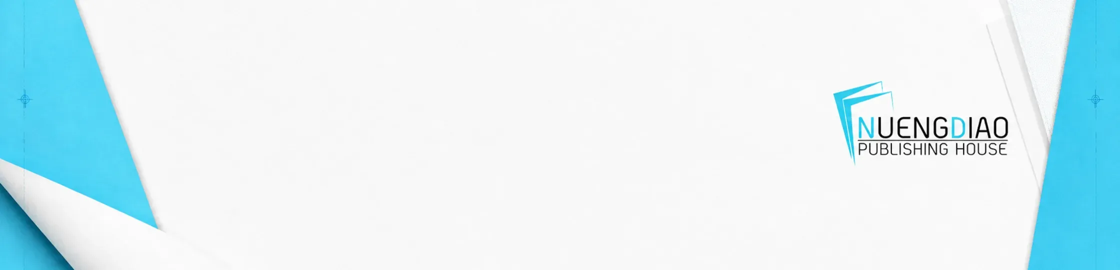
The logo symbol was inspired by the shape of open, layered book pages. The letter “N,” representing the first letter of Nuengdiao, was integrated into the symbol to create a distinctive and meaningful visual mark.
Its clean shapes and sharp lines give the logo a contemporary appearance while maintaining a clear connection to books, reading, and the publishing industry.
Colors and Typography
Cyan was selected as the primary brand color to communicate freshness, friendliness, and a more contemporary personality than that of a traditional publishing house. It is paired with black and white to maintain simplicity and provide flexibility across different applications.
Sans-serif typography was chosen to reinforce the clean and modern identity while ensuring readability across both digital and printed materials.
Brand Application
The identity was applied to business cards and other communication materials. Consistent use of color, typography, and negative space helped establish a unified and recognizable brand experience across every touchpoint.
This case study is presented using selected archived materials. Some of the original brand guidelines and supporting design files are no longer available.